When my client, Ranjeet Ramakrishnan, stepped into the studio apartment on the top floor of a quiet residential building and laid eyes on the large surrounding terrace and bright sunlight penetrating the cosy apartment he knew immediately that his search for a new workspace (and second home) was over!
Ranjeet wanted the space to: a) be minimalist, masculine, and unconventional; b) have multiple work stations, ample storage, and ‘age appropriate’ casual zones.
Essentially, a fun and functional reflection of the innovative brand that is okdone.
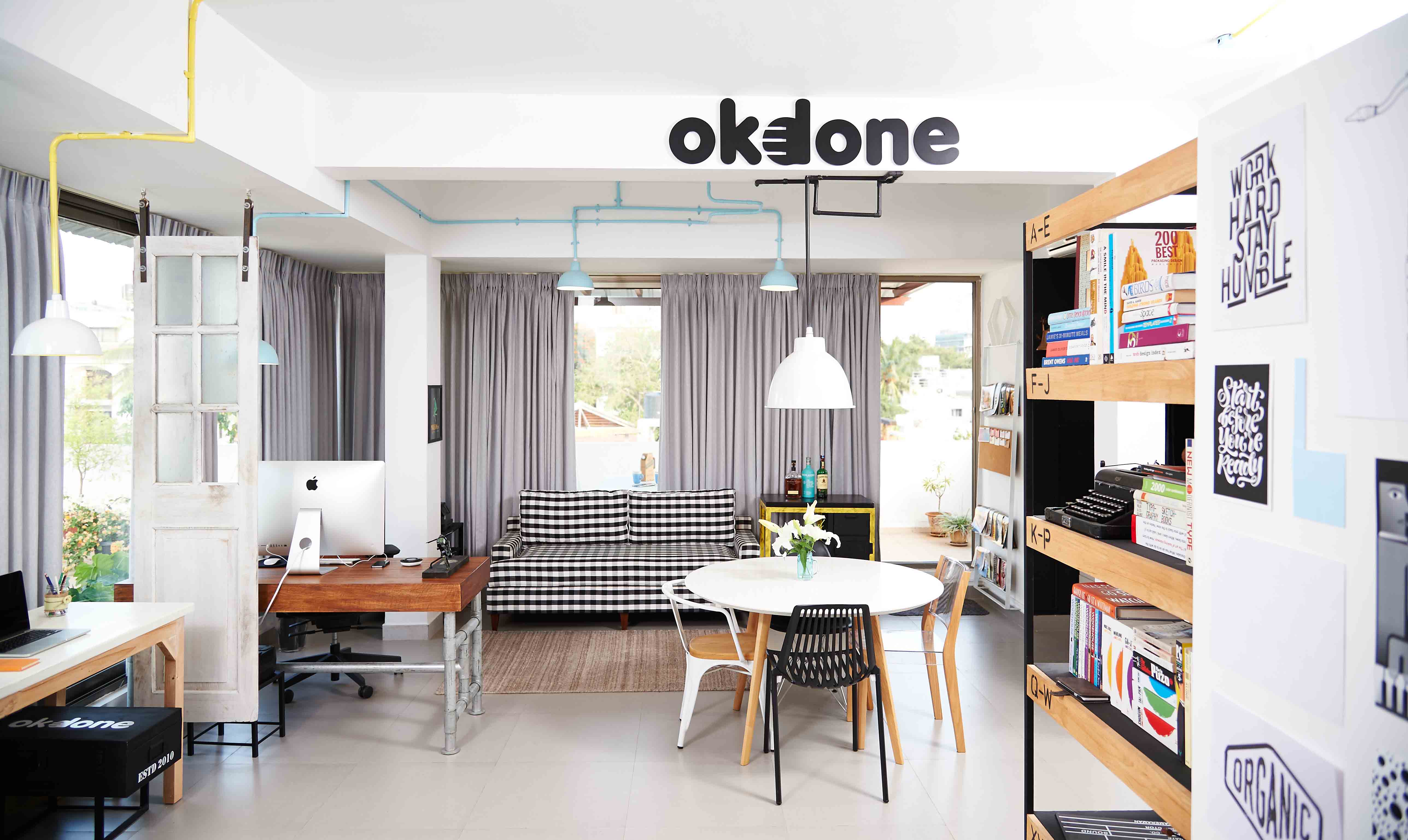
For this project, I stuck with a minimalist colour palette of black, white, and light grey and used pops of blue and yellow in restraint. The consistent colour scheme allowed me to experiment with a variety of materials (think wood, metal, pvc, acrylic, repurposed pieces) and add visual interest to the space.
By placing the bulky (but mobile) wardrobe next to the entrance, an entry passage is created which blocks a direct view of the washroom door as soon as one enters the studio.
The back of the wardrobe is used as a mood board to put up stray inspiration images. So a bulky piece which we were forced to live with has now transformed into a laboratory for inspired ideas.
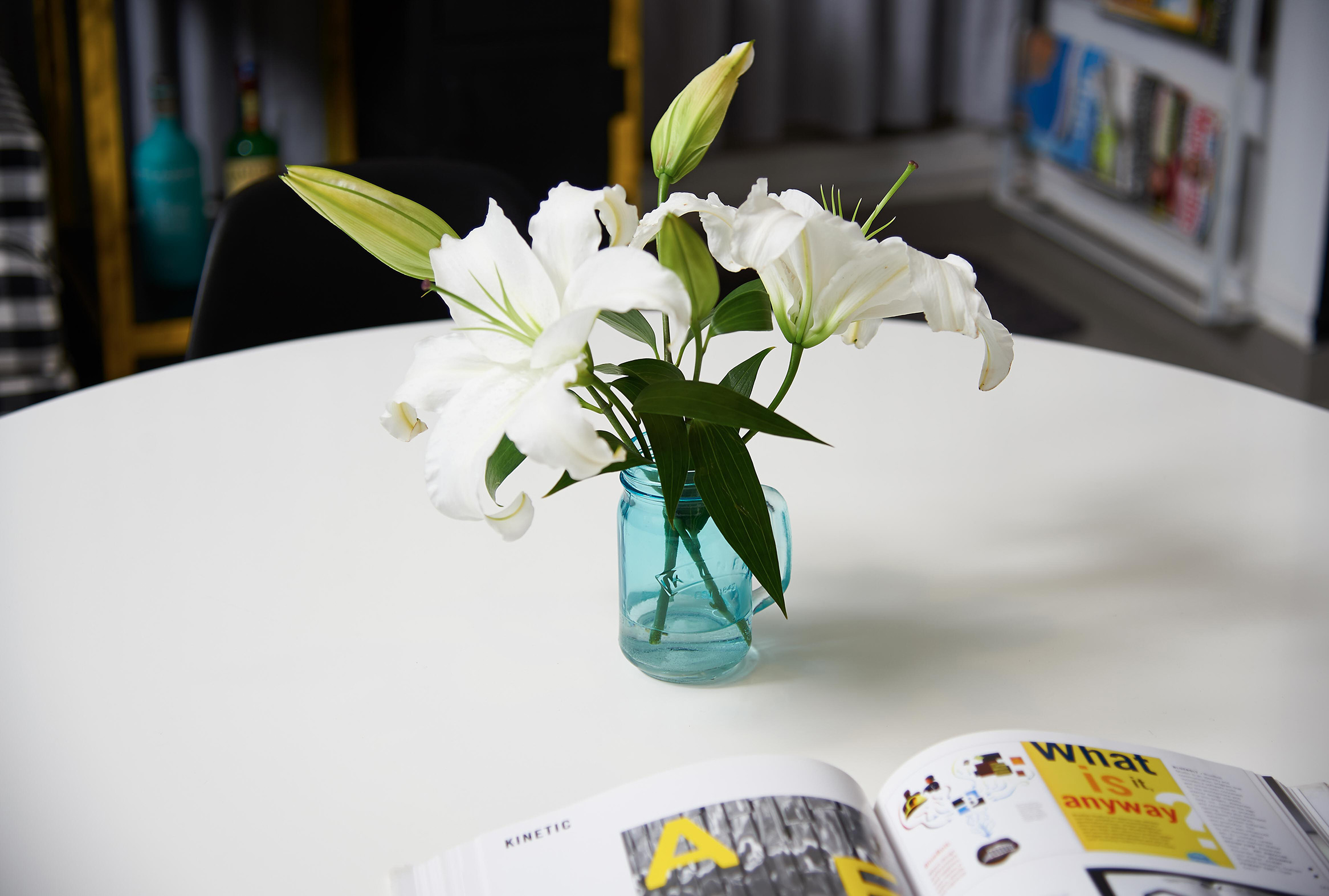
Surrounding a strategically-positioned, faux-marble tabletop sit four different sleek and modern chairs which perform three important roles: a brainstorming zone, a visual segue between the pantry and the work stations, and a dining table (for that rare uncomfortably warm day in Bangalore that may make one avoid having lunch on the terrace).
The corner to the left of the entrance has been dedicated to Ranjeet’s love of music.
A minimalist BOSE wireless sound system provides high quality music through the studio and above which are placed custom made industrial frames and vintage pictures from Ranjeet’s favourite music genres, gently highlighted by string lights – lending a lovely mellow lounge like ambience.
A gingham-influenced, custom-built couch sits between a printer and a bar cart. With its classic, clean lines, plush cushioning, and gently tapered legs, the effortlessly sexy couch makes the lounge area. The bold pop of pattern stands out amongst all the solid colours and keeps things exciting!
Having worked in advertising for years, Ranjeet was insistent on having a bar cart to bring in a touch of old school (read Mad Men). Instead of a traditional wood or chrome/brass bar cart, this one has pulley wheels, greased structure, and a wooden top.
The pairing of a rather refined couch with a rugged bar cart creates tension and introduces a touch of eclectism.
View More Projects
To view all pictures of the project, do visit our Instagram
PROJECT : Okdone Design & Ideas
CLIENT: Ranjeet Ramakrishnan (Graphic Designer)
AREA : 500 sq ft
ARTIST: Mechanimal
PHOTOGRAPHER: Angad Achhapa
YEAR: 2016 (Freelance Project)
When my client, Ranjeet Ramakrishnan, stepped into the studio apartment on the top floor of a quiet residential building and laid eyes on the large surrounding terrace and bright sunlight penetrating the cosy apartment he knew immediately that his search for a new workspace (and second home) was over!
Ranjeet wanted the space to: a) be minimalist, masculine, and unconventional; b) have multiple work stations, ample storage, and ‘age appropriate’ casual zones.
Essentially, a fun and functional reflection of the innovative brand that is okdone.
For this project, I stuck with a minimalist colour palette of black, white, and light grey and used pops of blue and yellow in restraint. The consistent colour scheme allowed me to experiment with a variety of materials (think wood, metal, pvc, acrylic, repurposed pieces) and add visual interest to the space.
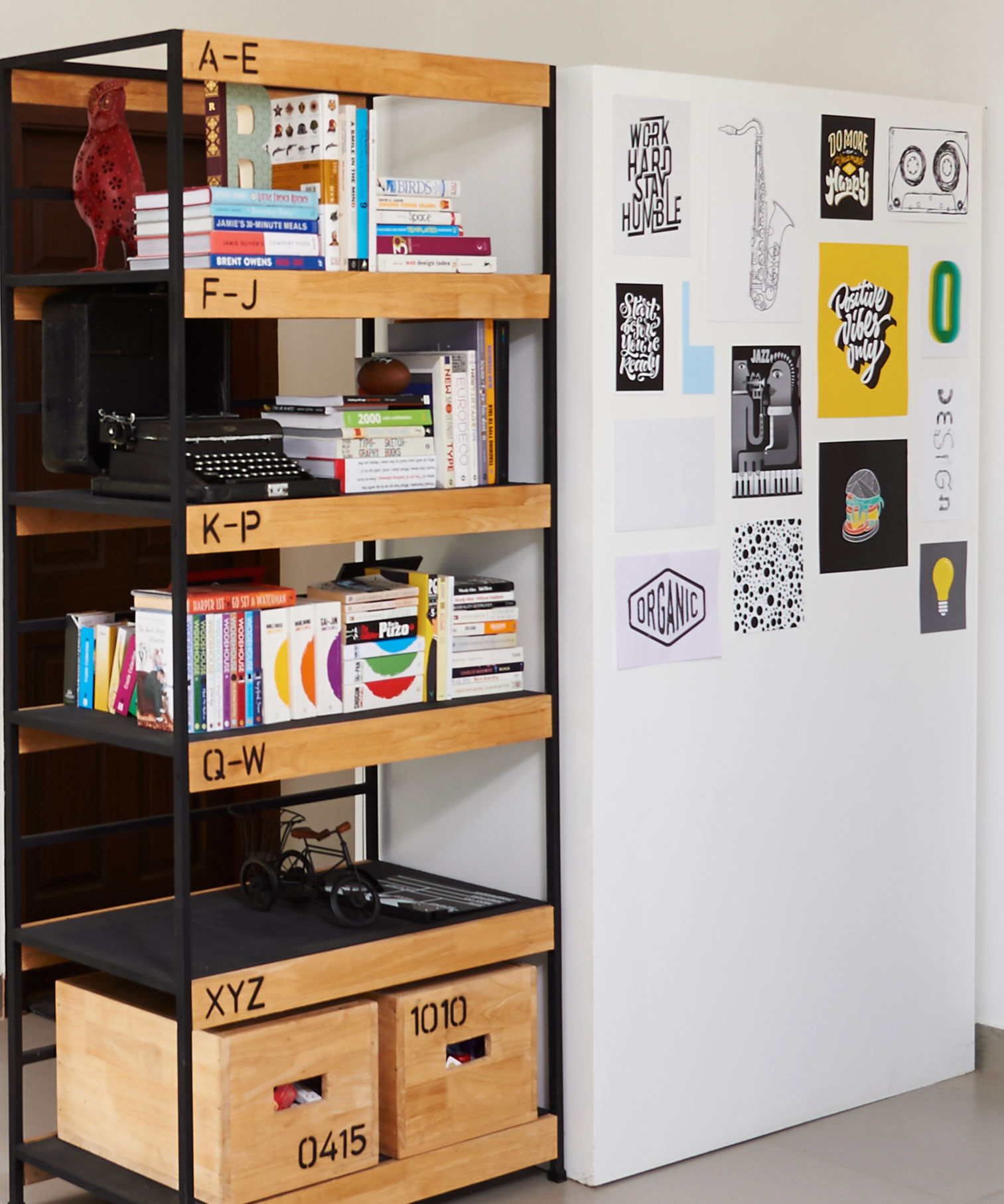
By placing the bulky (but mobile) wardrobe next to the entrance, an entry passage is created which blocks a direct view of the washroom door as soon as one enters the studio.
The back of the wardrobe is used as a mood board to put up stray inspiration images. So a bulky piece which we were forced to live with has now transformed into a laboratory for inspired ideas.
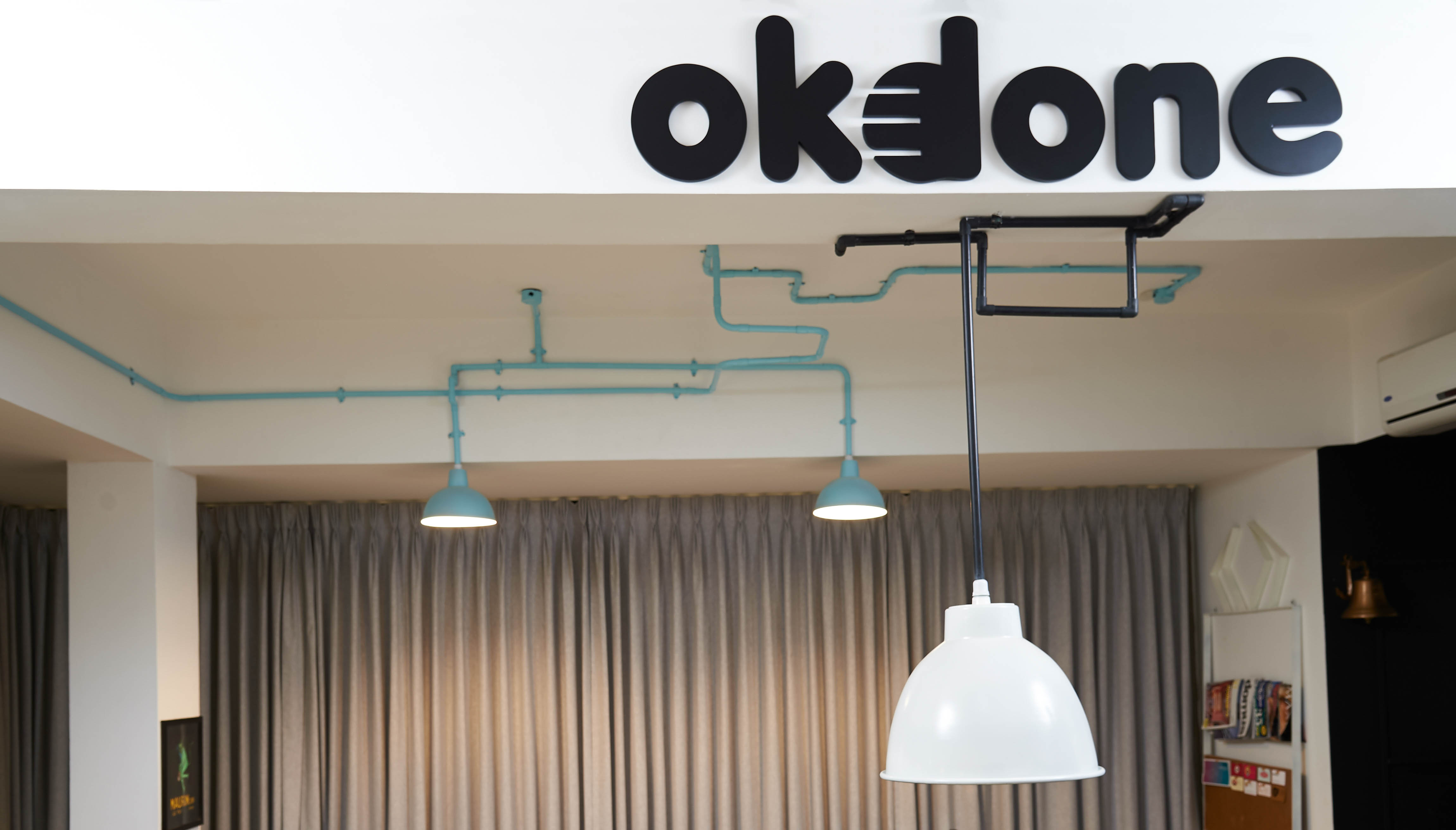
The strategically placed logo of the company in black & bold on the beam directly opposite the entryway makes for striking visual branding that is immediately apparent to everyone that walks in the door - whether they’re a client, employee, friend, or a delivery guy.
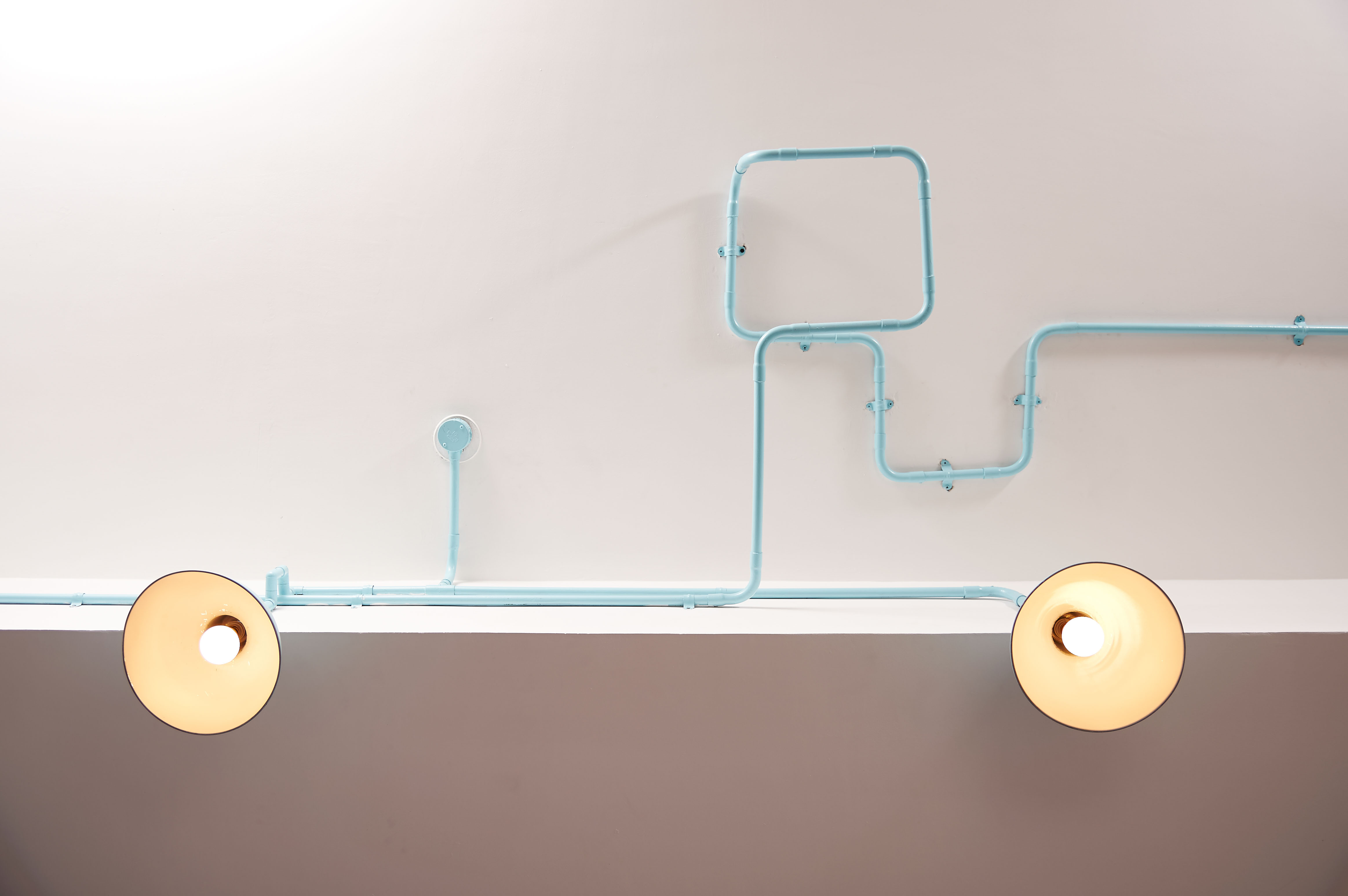
An eye-catching, artistic light installation created from pvc pipes and metal shades energises the design and clearly demarcates each functional area.
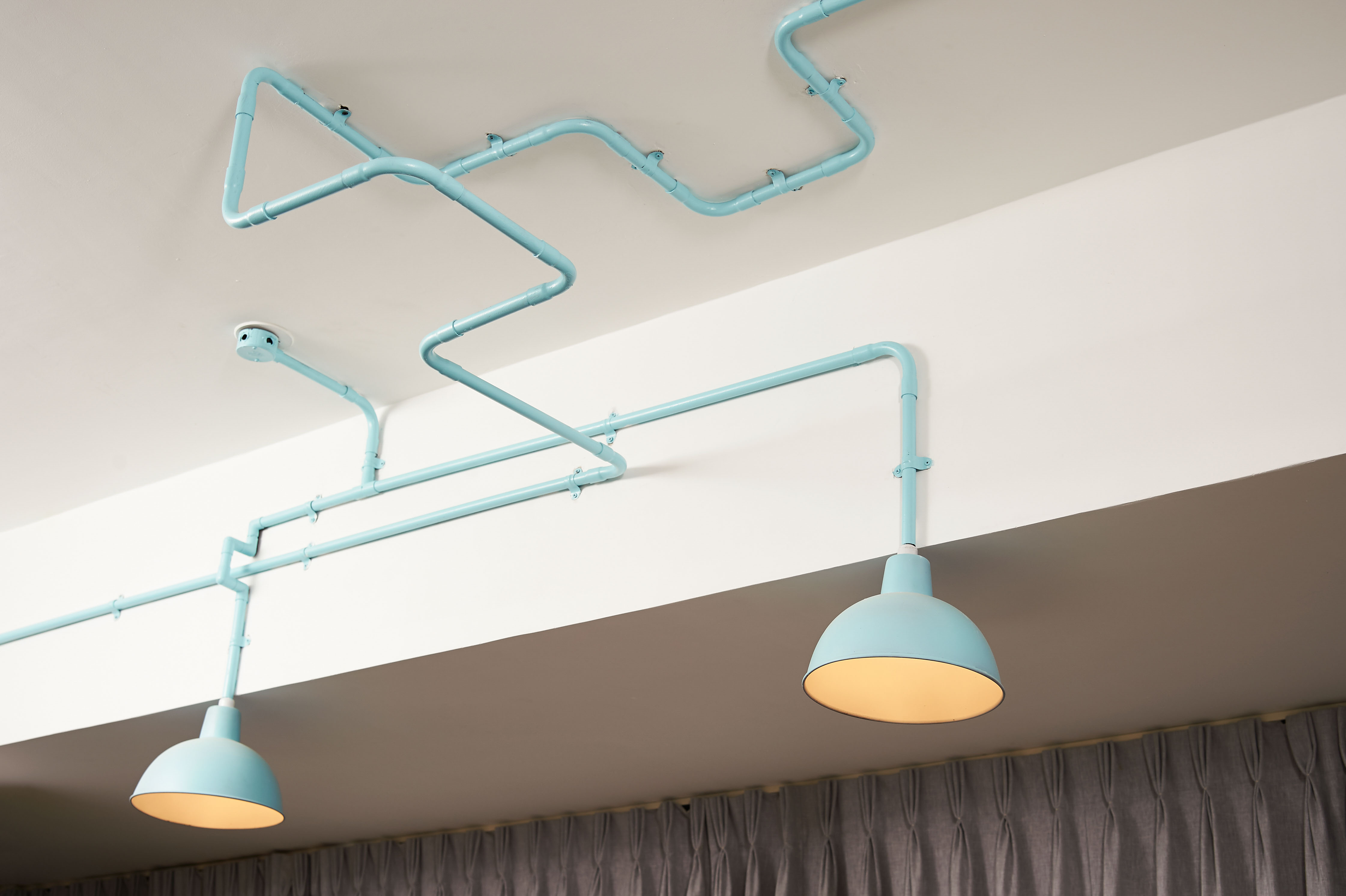
The colourful custom light installation pops against the reserved palette, engages visual curiosity, and elevates the overall design.
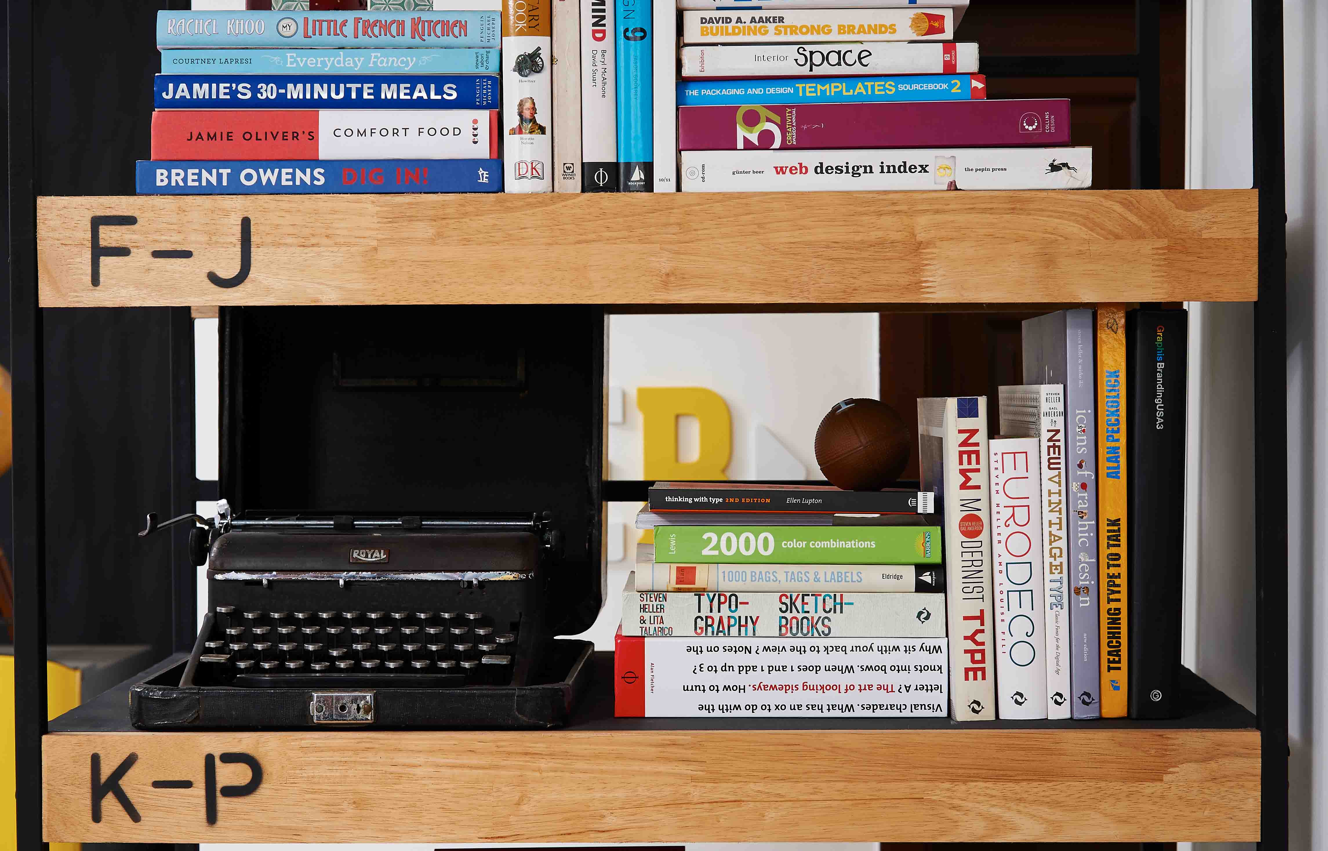
An industrial book shelf provides storage for Ranjeet’s book collection while leaving room for his choice of interesting objects and knick-knacks (typewriter, baseball, etc).
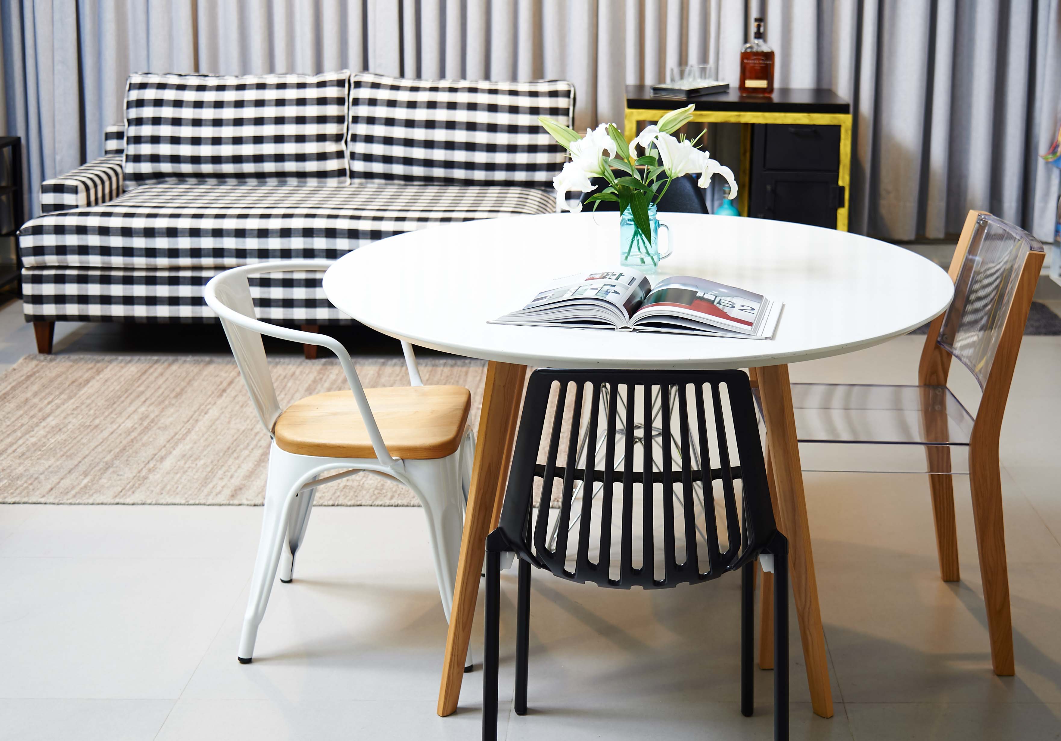
Surrounding a strategically-positioned, faux-marble tabletop sit four different sleek and modern chairs which perform three important roles: a brainstorming zone, a visual segue between the pantry and the work stations, and a dining table (for that rare uncomfortably warm day in Bangalore that may make one avoid having lunch on the terrace).
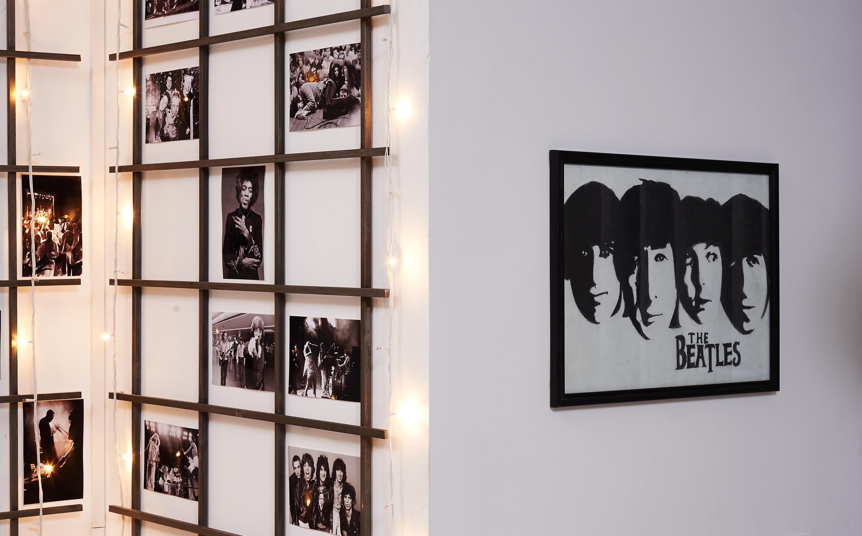
The corner to the left of the entrance has been dedicated to Ranjeet’s love of music.
A minimalist BOSE wireless sound system provides high quality music through the studio and above which are placed custom made industrial frames and vintage pictures from Ranjeet’s favourite music genres, gently highlighted by string lights – lending a lovely mellow lounge like ambience.
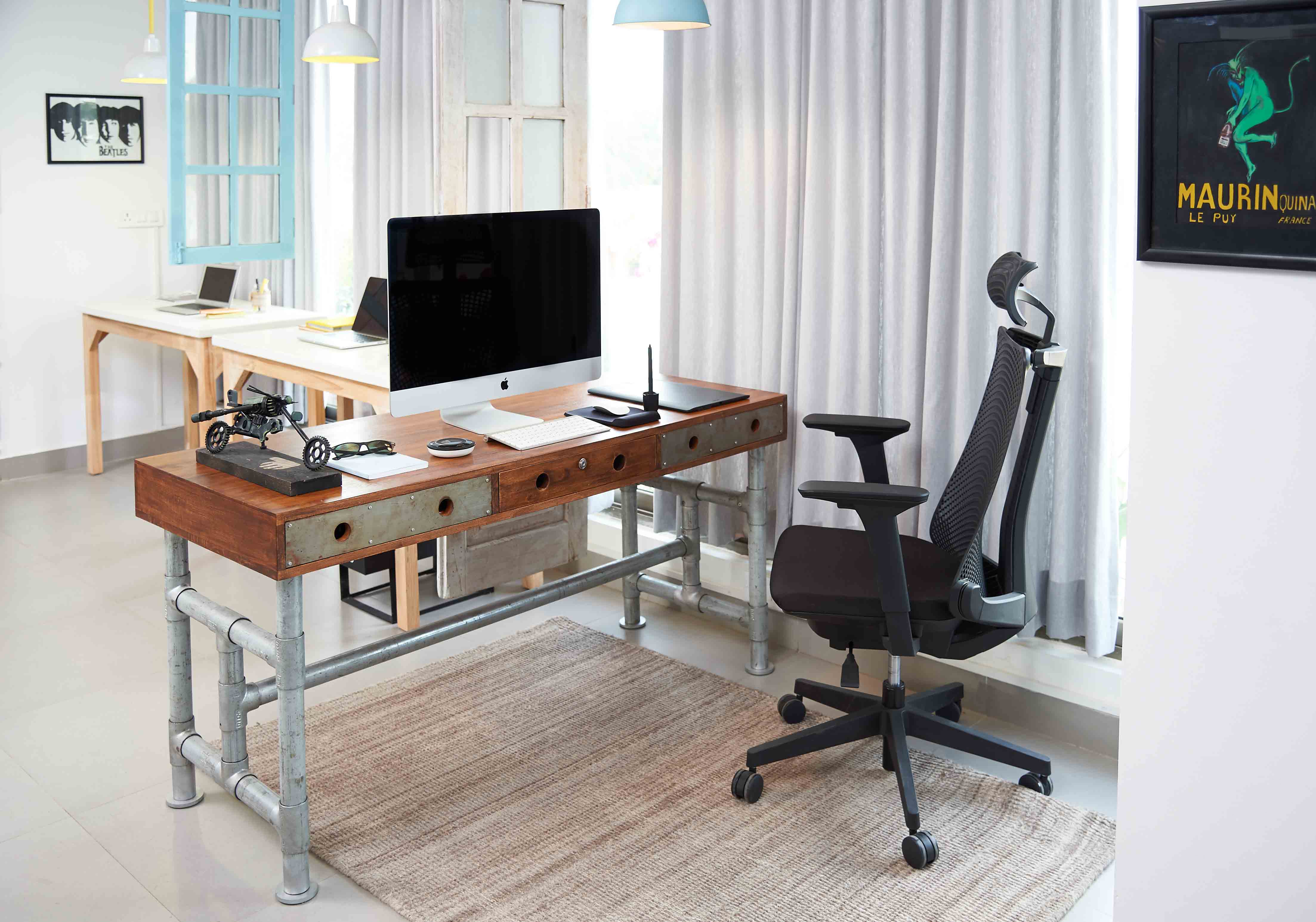
The main work zone is Ranjeet’s desk – placed parallel to the entrance, at the far end of the left side of the studio and provides a panoramic view of the terrace garden as well as of the main entrance.
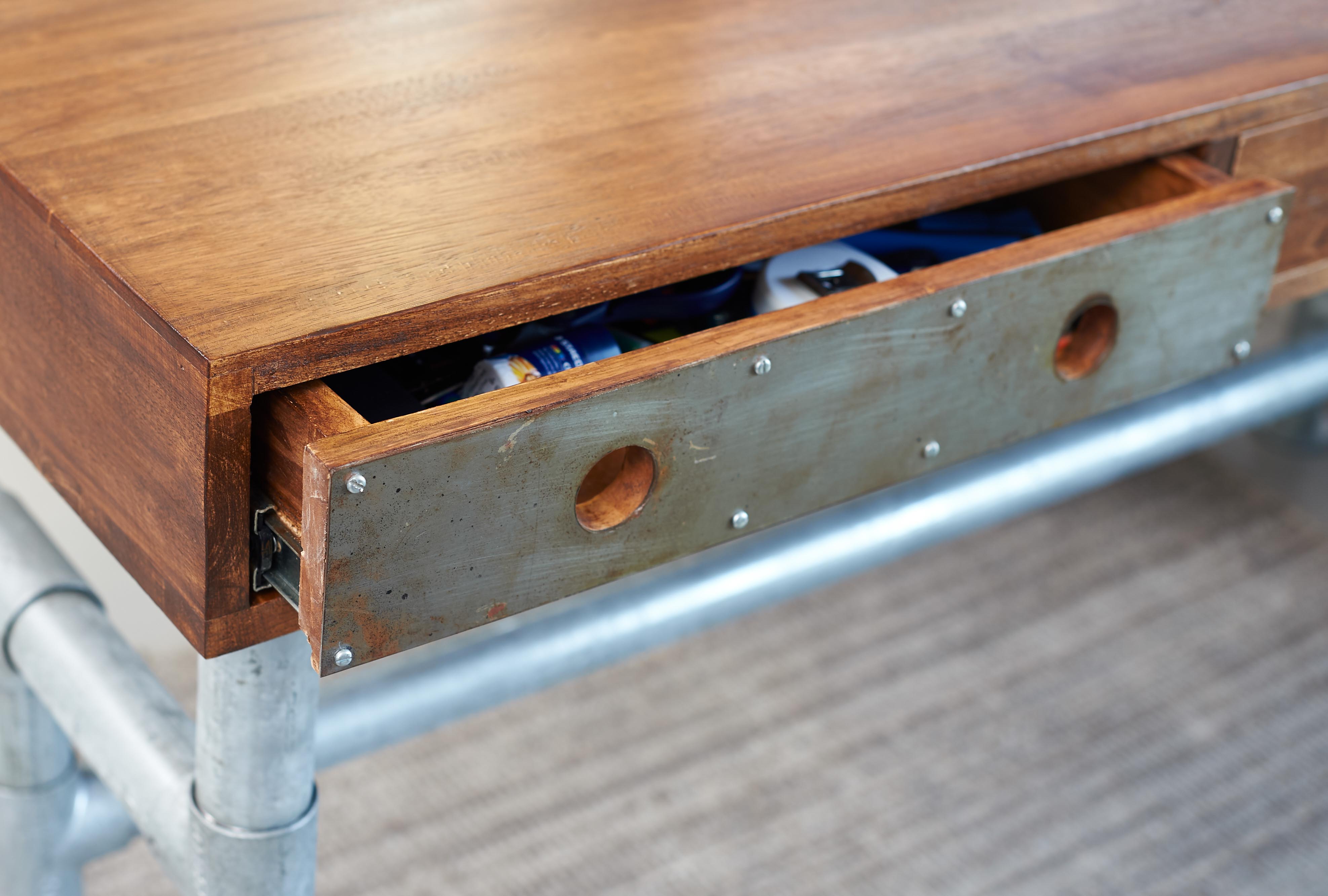
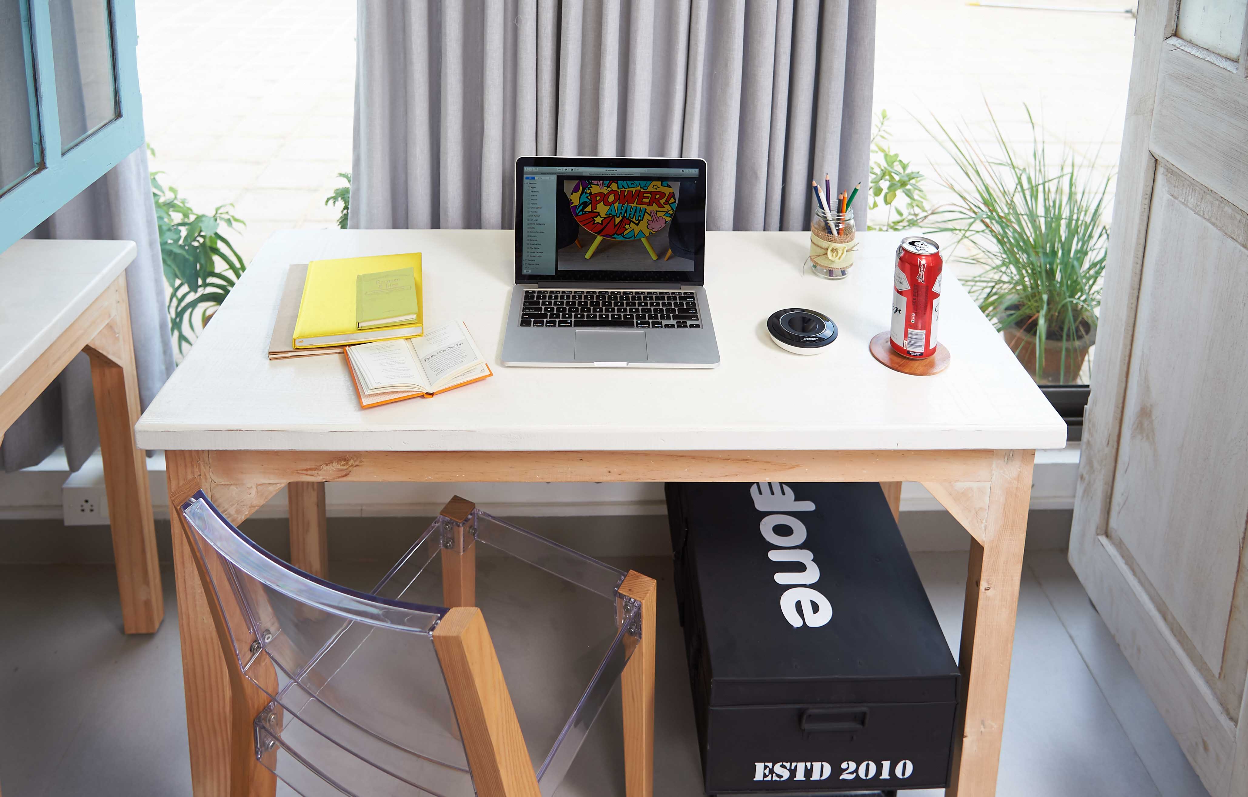
A statement, custom made, industrial desk with 3 deep drawers provides ample storage for all of Ranjeet’s work needs.
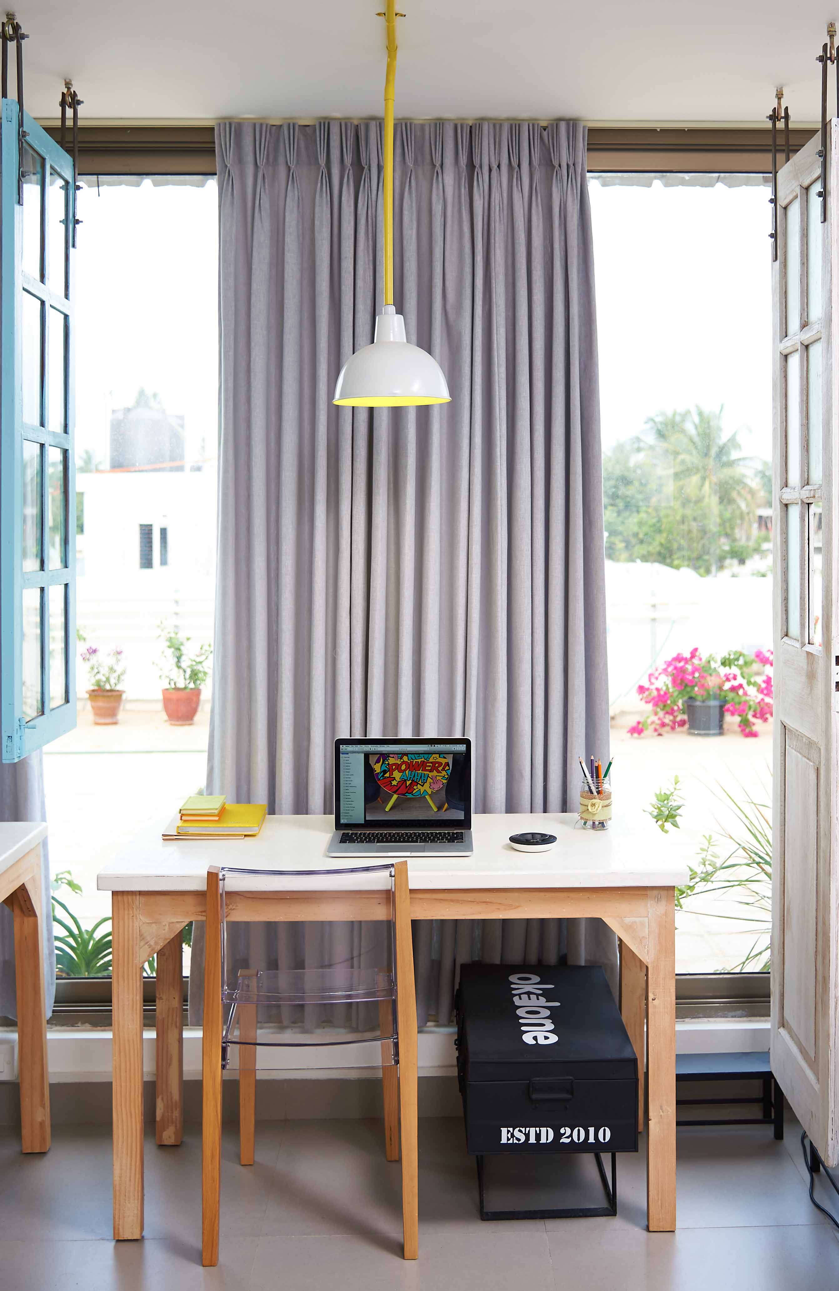
For the other 2 workstations, minimalist, slim, straight desks have been placed facing the glass windows, saving space while ensuring lovely views of the terrace garden.
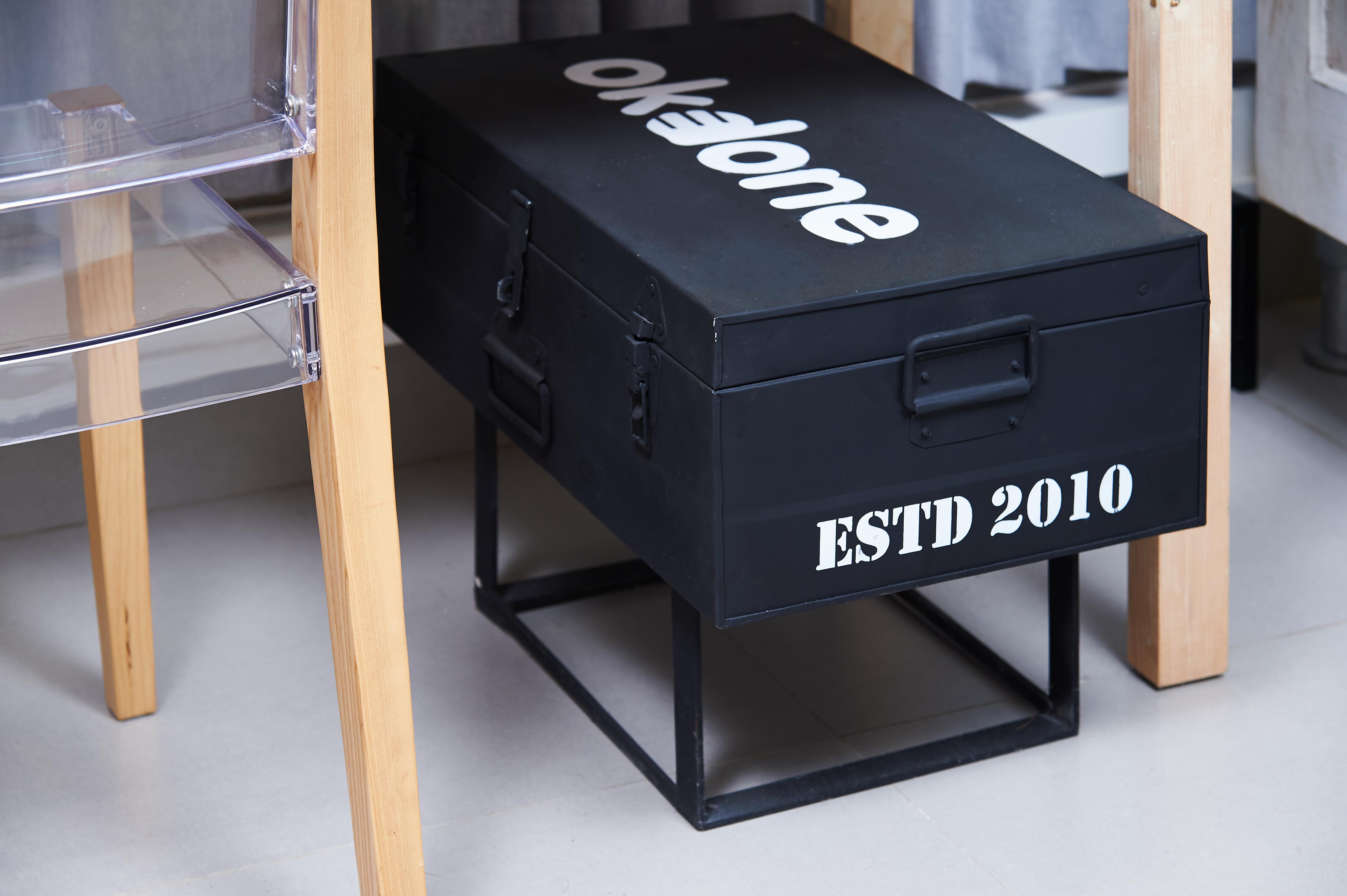
A customised, monochrome, metal trunk is placed under each desk to provide extra storage.
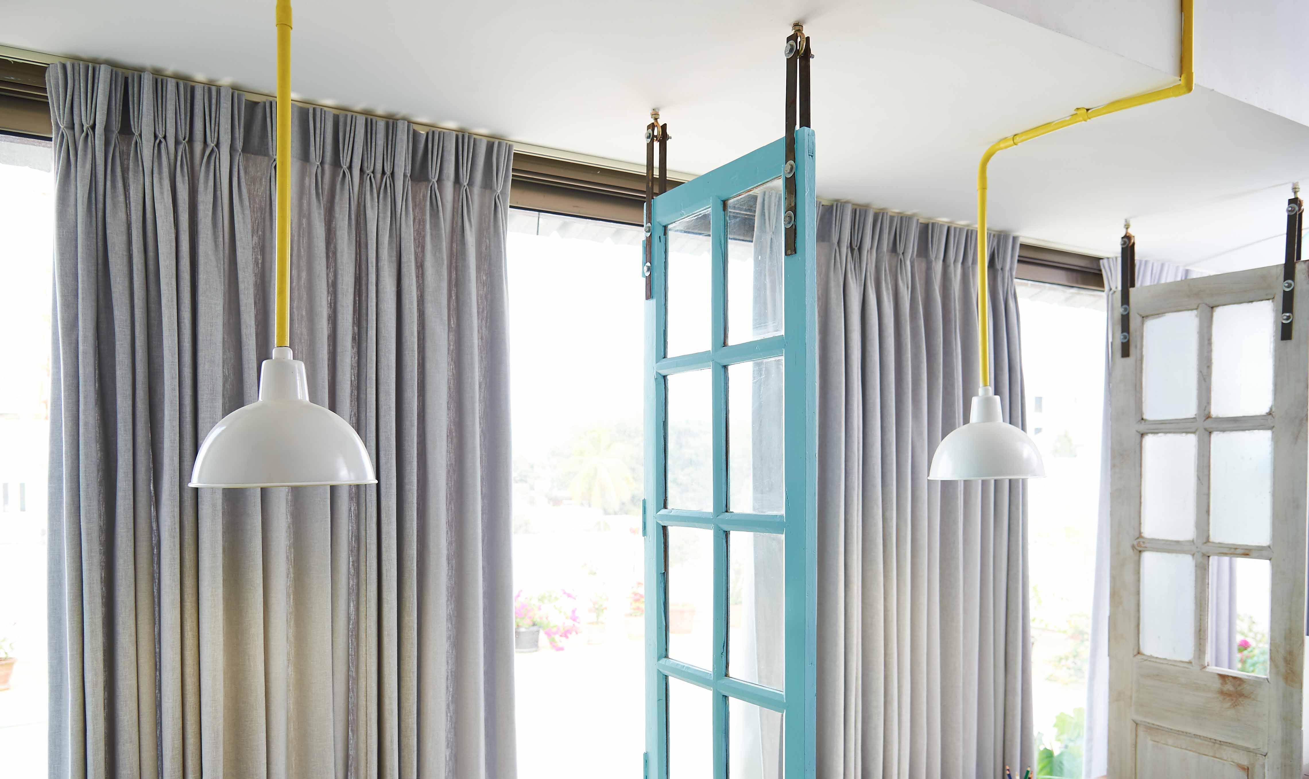
I love objects that I can repurpose and reuse in unusual ways. An old door and window from a local market is used as partitions between workstations.
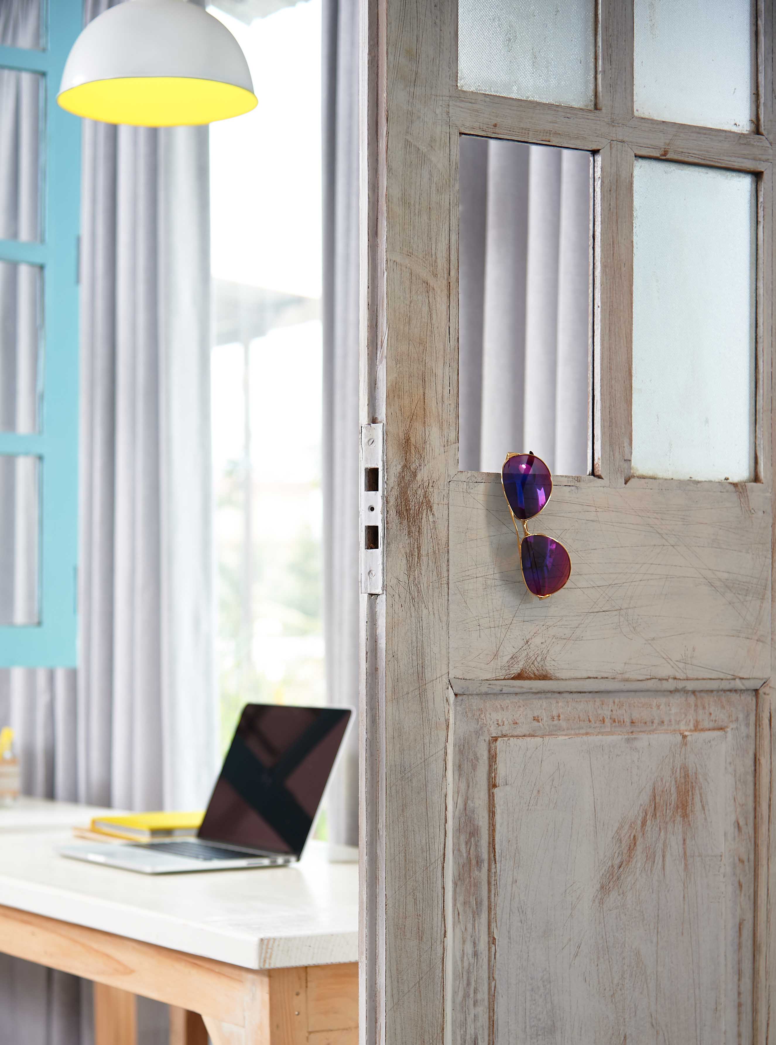
The missing glass, and aged, weathered-look adds character to the work zone.
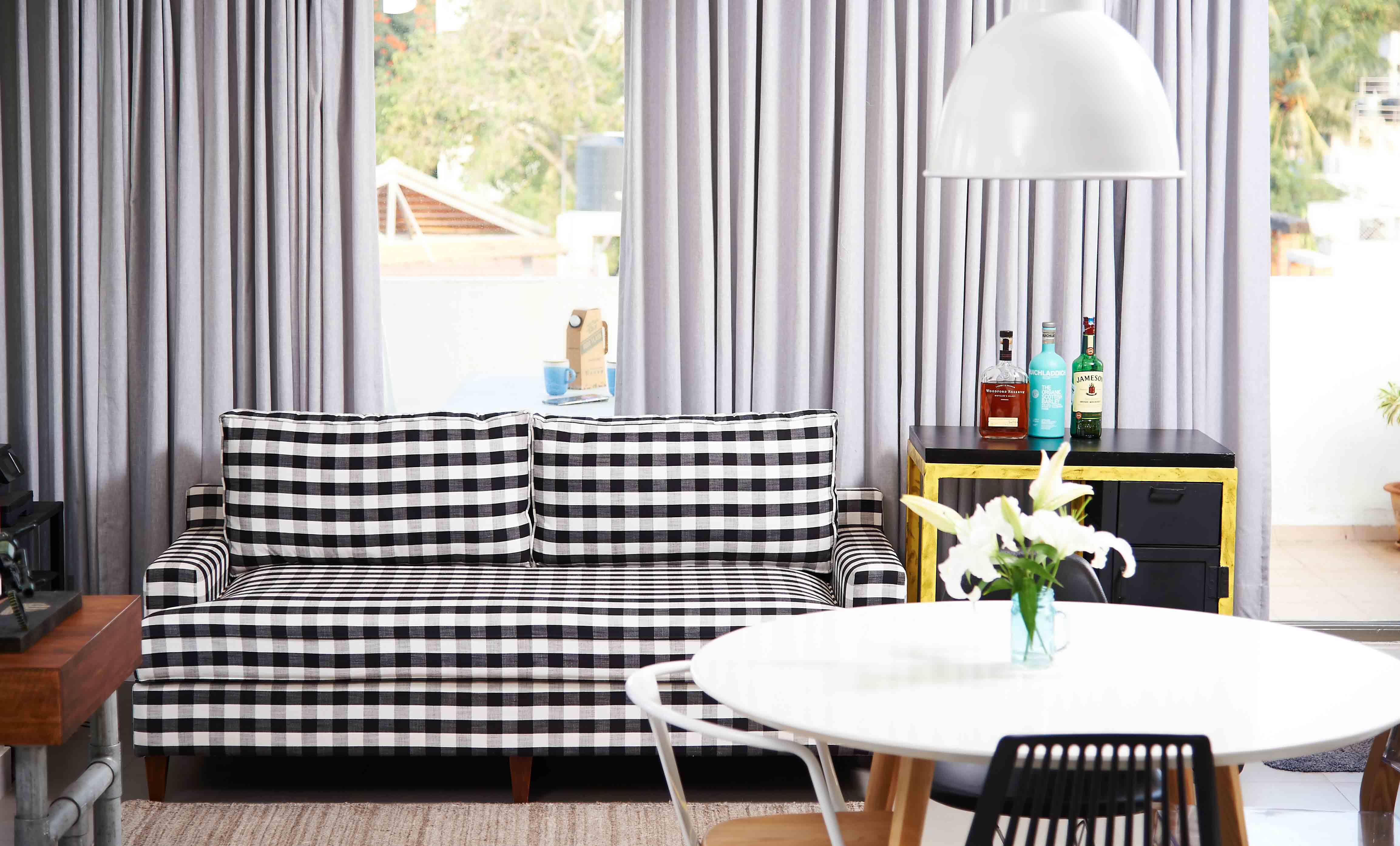
A gingham-influenced, custom-built couch sits between a printer and a bar cart. With its classic, clean lines, plush cushioning, and gently tapered legs, the effortlessly sexy couch makes the lounge area. The bold pop of pattern stands out amongst all the solid colours and keeps things exciting!
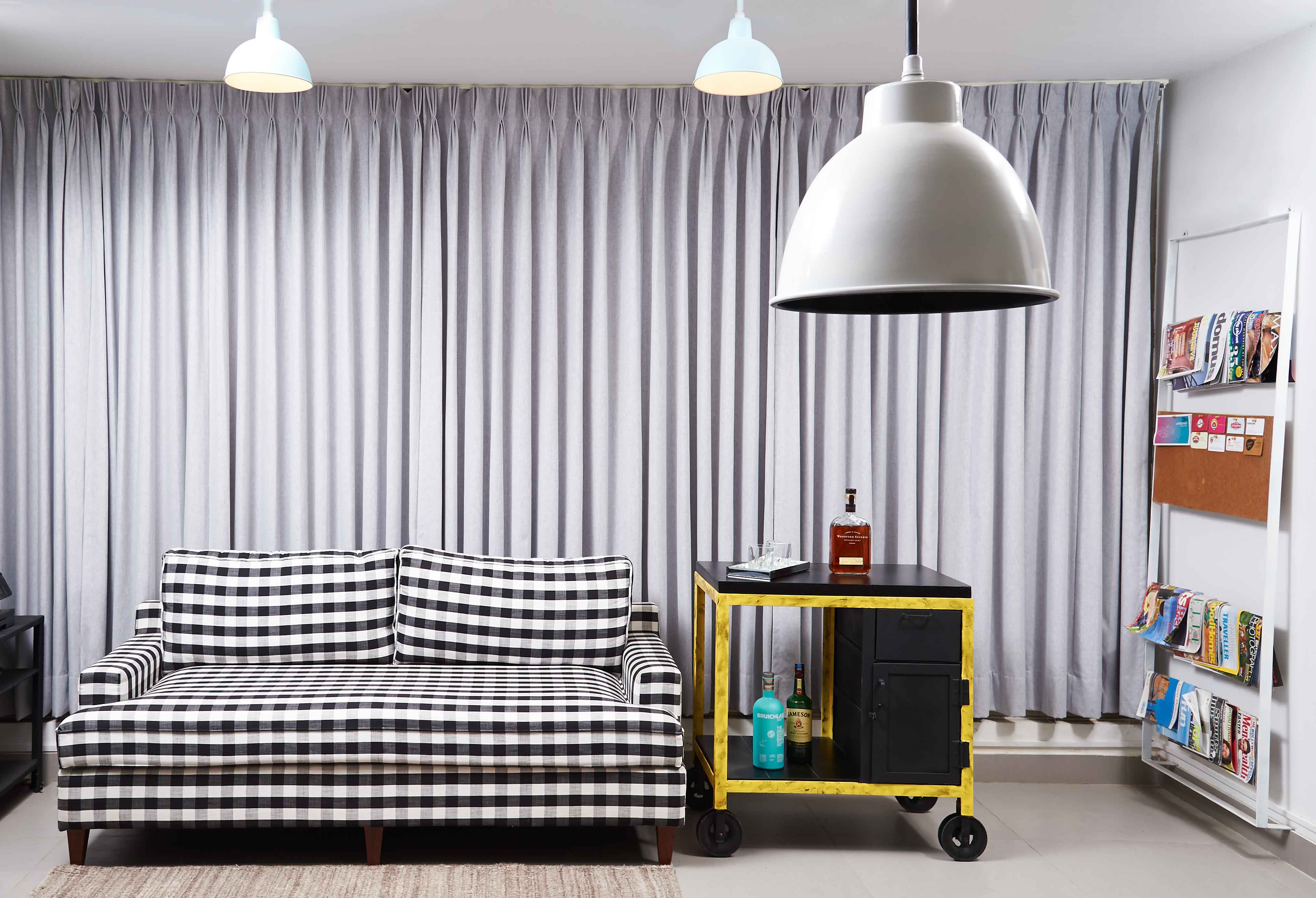
Having worked in advertising for years, Ranjeet was insistent on having a bar cart to bring in a touch of old school (read Mad Men). Instead of a traditional wood or chrome/brass bar cart, this one has pulley wheels, greased structure, and a wooden top.
The pairing of a rather refined couch with a rugged bar cart creates tension and introduces a touch of eclectism.
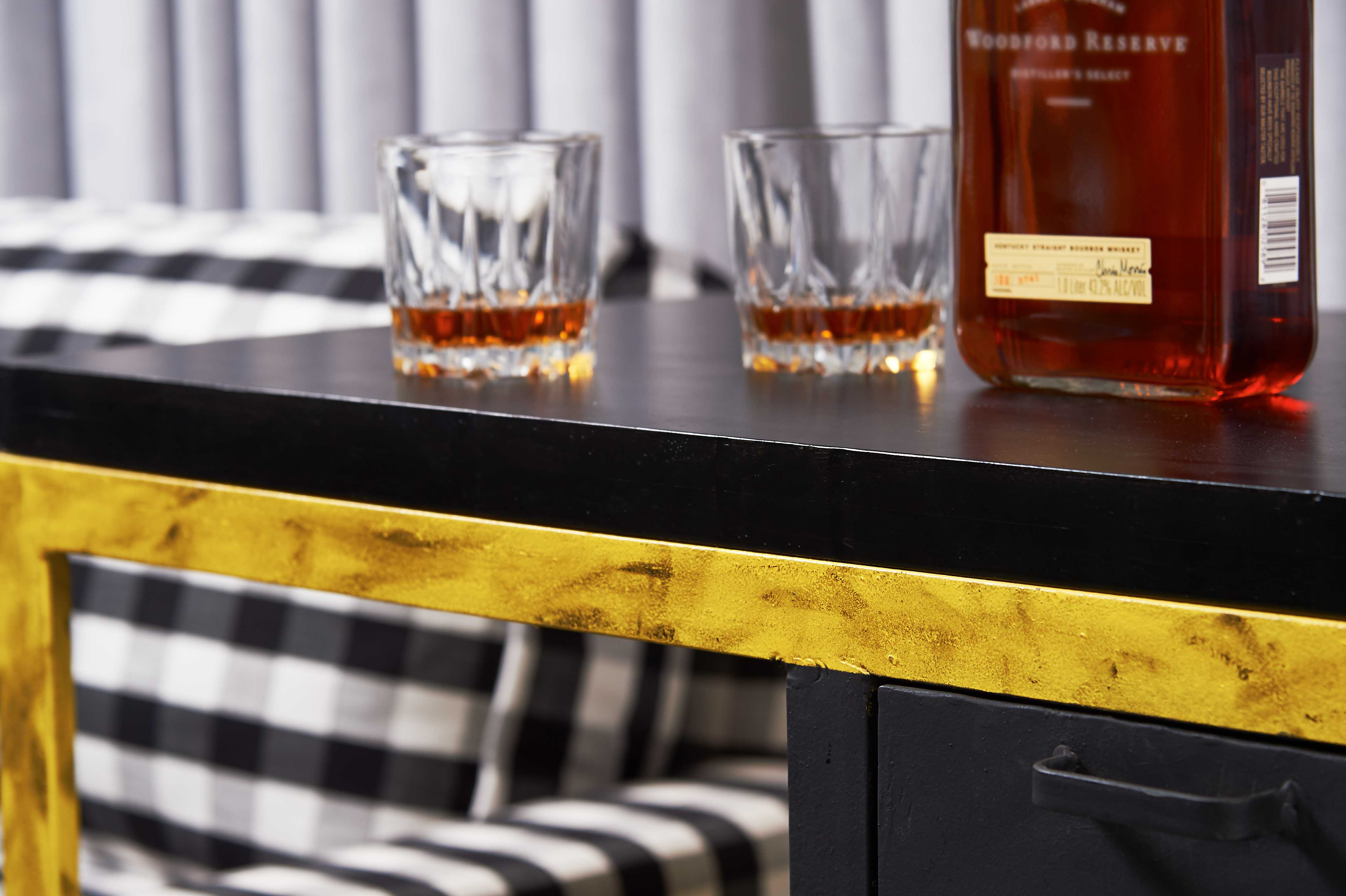
The black and yellow bar also serves as a side table and has ample storage for glasses, decanters, trays, ice buckets, and a prized whiskey collection.
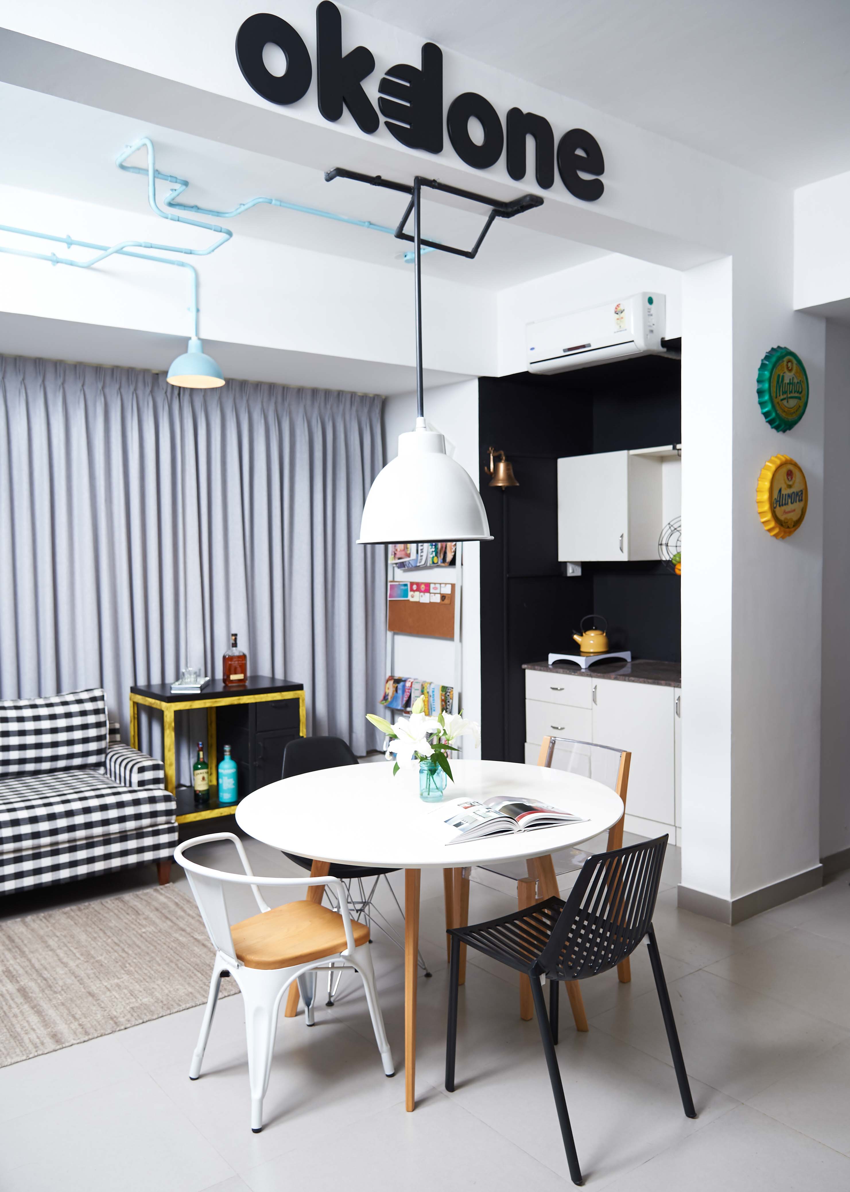
Chalkboard walls replace the whitewashed walls and work as a striking backdrop for the white cabinets and also help demarcate the pantry area.
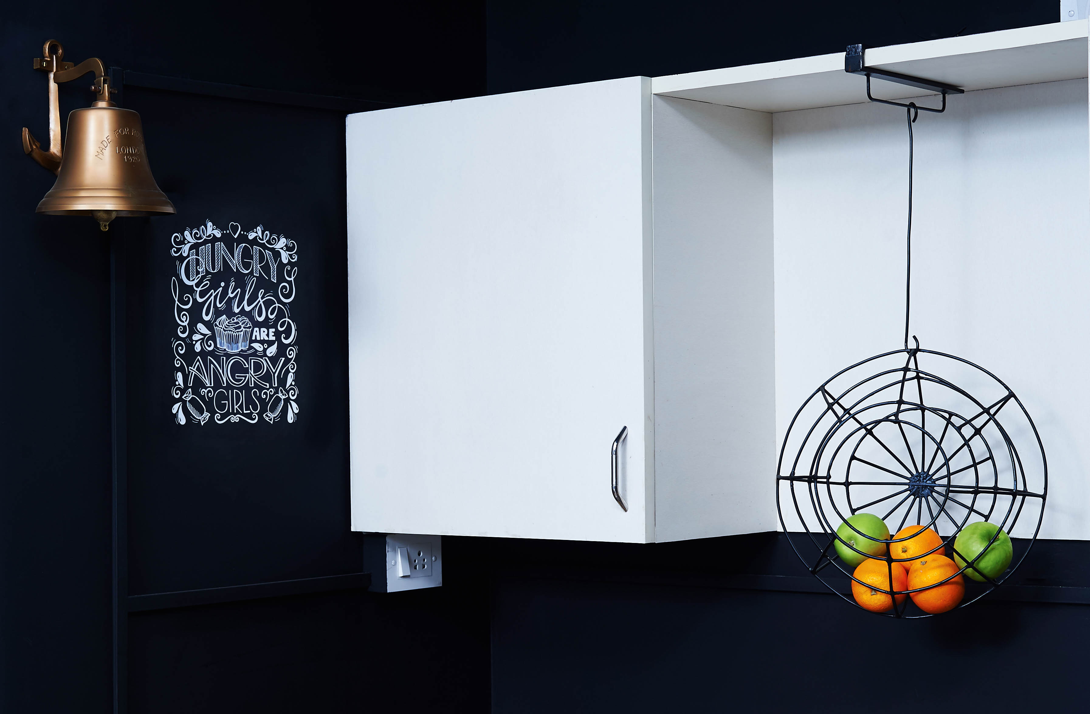
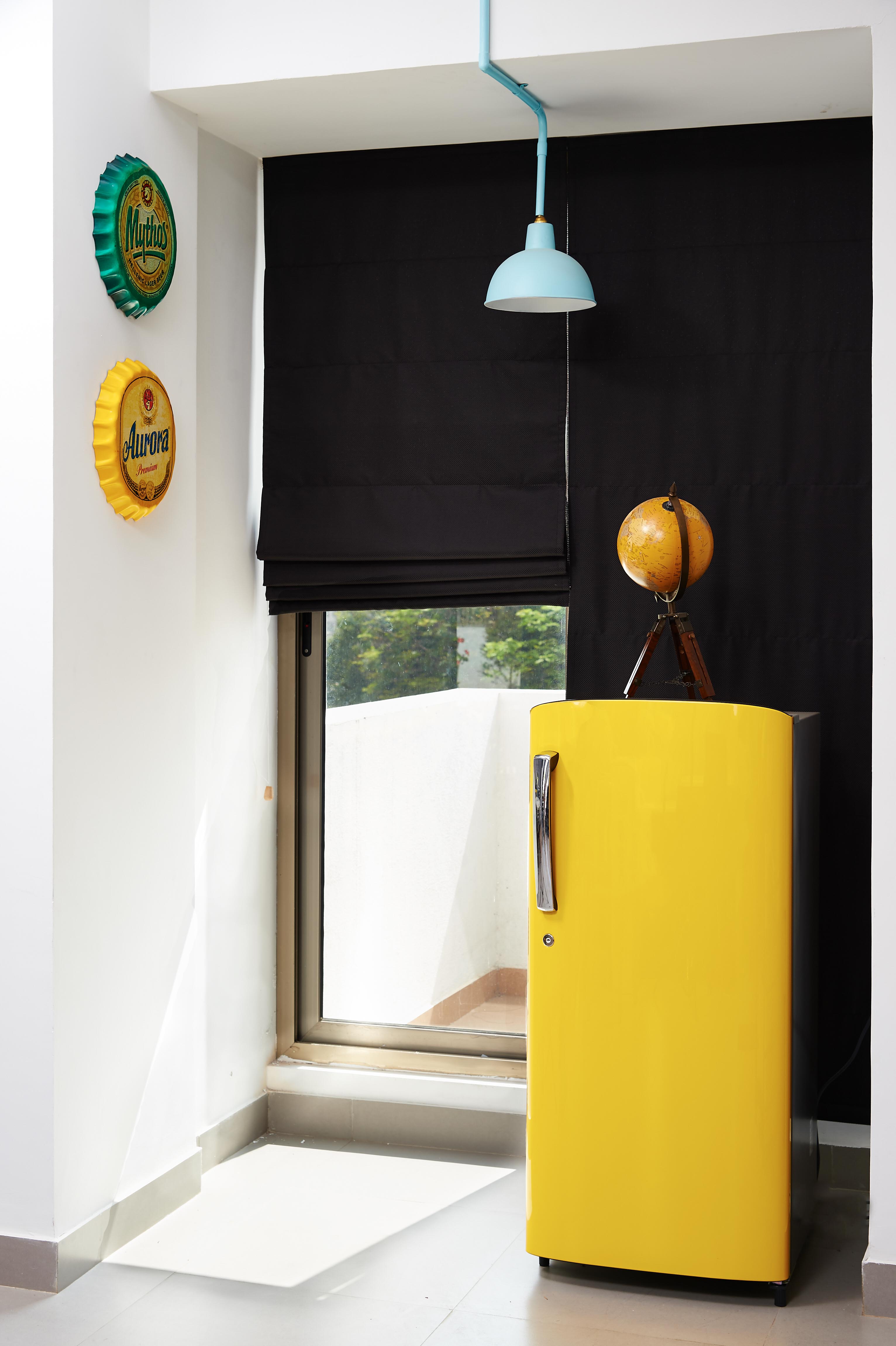
The addition of an antique brass bell, carefully selected kitchenware, a bright yellow fridge and vintage giant beer bottle caps sourced from Singapore complete the look.
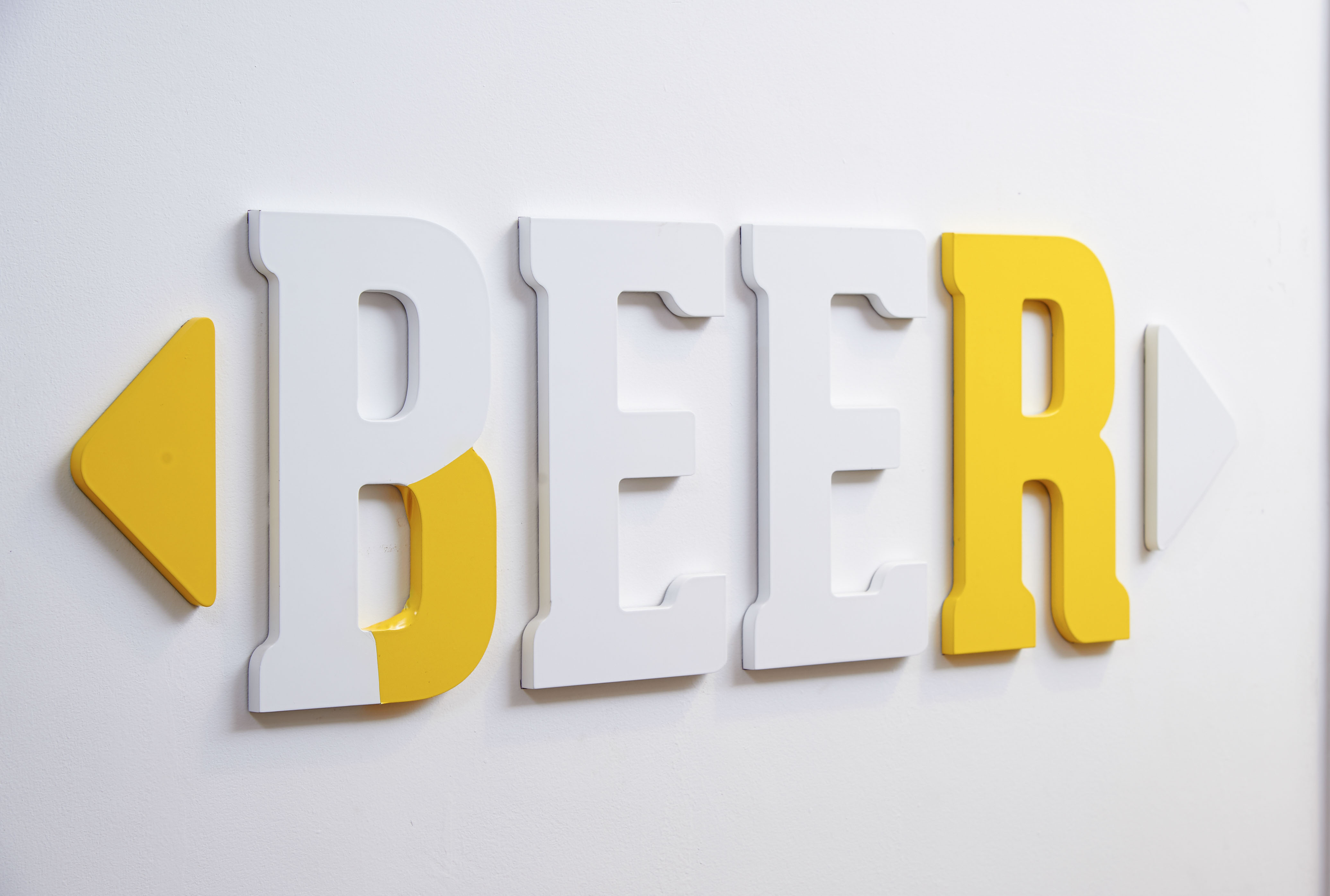
Elements of intelligent humour has been injected into the design through strategically placed graphics in the bathroom passage.
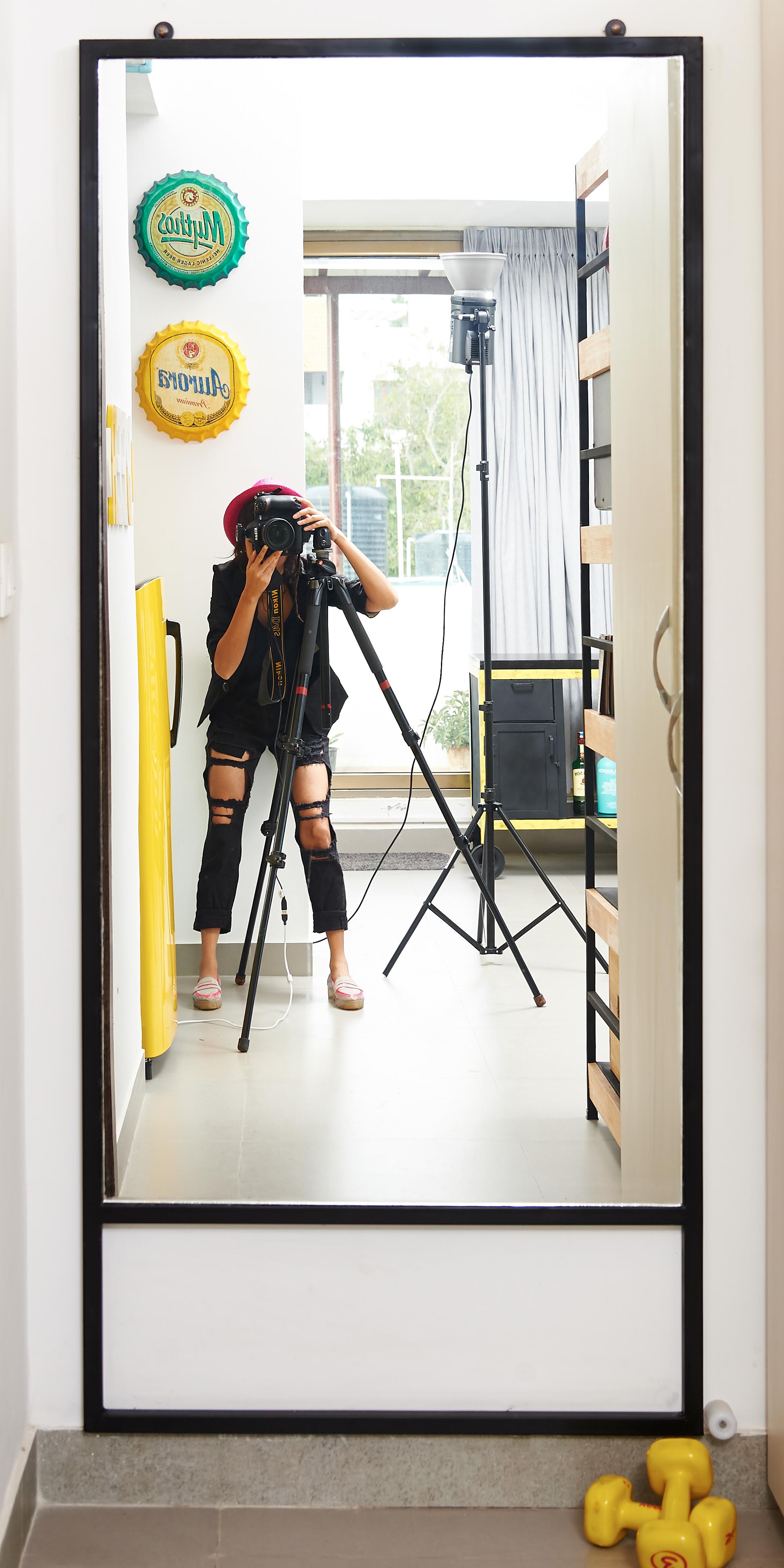
To create an illusion of space, a large industrial style mirror is installed in the corner.
This also transforms the passage into a dressing room, allowing for a quick change before heading out for post-work evenings.
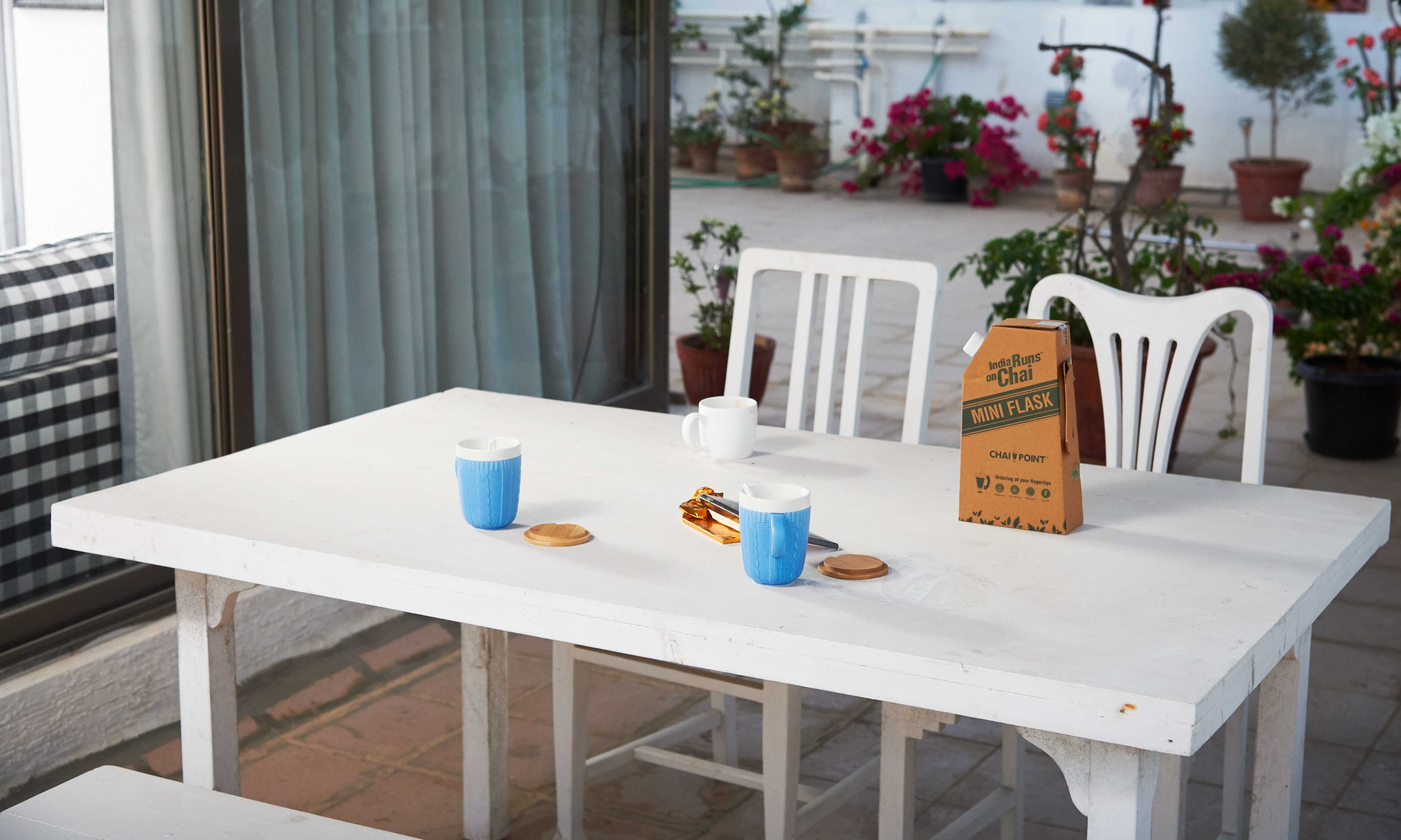
Often it only takes a chai break on the lovely terrace to get work done at okdone.
PROJECT : Okdone Design & Ideas
CLIENT: Ranjeet Ramakrishnan (Graphic Designer)
AREA: 500 sq ft
ARTIST: Mechanimal
PHOTOGRAPHER: Angad Achhapa
YEAR: 2016 (Freelance Project)

When my client, Ranjeet Ramakrishnan, stepped into the studio apartment on the top floor of a quiet residential building and laid eyes on the large surrounding terrace and bright sunlight penetrating the cosy apartment he knew immediately that his search for a new workspace (and second home) was over!
Ranjeet wanted the space to: a) be minimalist, masculine, and unconventional; b) have multiple work stations, ample storage, and ‘age appropriate’ casual zones.
Essentially, a fun and functional reflection of the innovative brand that is okdone.

For this project, I stuck with a minimalist colour palette of black, white, and light grey and used pops of blue and yellow in restraint. The consistent colour scheme allowed me to experiment with a variety of materials (think wood, metal, pvc, acrylic, repurposed pieces) and add visual interest to the space.

By placing the bulky (but mobile) wardrobe next to the entrance, an entry passage is created which blocks a direct view of the washroom door as soon as one enters the studio.
The back of the wardrobe is used as a mood board to put up stray inspiration images. So a bulky piece which we were forced to live with has now transformed into a laboratory for inspired ideas.

The strategically placed logo of the company in black & bold on the beam directly opposite the entryway makes for striking visual branding that is immediately apparent to everyone that walks in the door - whether they’re a client, employee, friend, or a delivery guy.

An eye-catching, artistic light installation created from pvc pipes and metal shades energises the design and clearly demarcates each functional area.

The colourful custom light installation pops against the reserved palette, engages visual curiosity, and elevates the overall design.

An industrial book shelf provides storage for Ranjeet’s book collection while leaving room for his choice of interesting objects and knick-knacks (typewriter, baseball, etc).

Surrounding a strategically-positioned, faux-marble tabletop sit four different sleek and modern chairs which perform three important roles: a brainstorming zone, a visual segue between the pantry and the work stations, and a dining table (for that rare uncomfortably warm day in Bangalore that may make one avoid having lunch on the terrace).

The corner to the left of the entrance has been dedicated to Ranjeet’s love of music.
A minimalist BOSE wireless sound system provides high quality music through the studio and above which are placed custom made industrial frames and vintage pictures from Ranjeet’s favourite music genres, gently highlighted by string lights – lending a lovely mellow lounge like ambience.

The main work zone is Ranjeet’s desk – placed parallel to the entrance, at the far end of the left side of the studio and provides a panoramic view of the terrace garden as well as of the main entrance.

A statement, custom made, industrial desk with 3 deep drawers provides ample storage for all of Ranjeet’s work needs.

For the other 2 workstations, minimalist, slim, straight desks have been placed facing the glass windows, saving space while ensuring lovely views of the terrace garden.

A customised, monochrome, metal trunk is placed under each desk to provide extra storage.

I love objects that I can repurpose and reuse in unusual ways. An old door and window from a local market is used as partitions between workstations.

The missing glass, and aged, weathered-look adds character to the work zone.

A gingham-influenced, custom-built couch sits between a printer and a bar cart. With its classic, clean lines, plush cushioning, and gently tapered legs, the effortlessly sexy couch makes the lounge area. The bold pop of pattern stands out amongst all the solid colours and keeps things exciting!

Having worked in advertising for years, Ranjeet was insistent on having a bar cart to bring in a touch of old school (read Mad Men). Instead of a traditional wood or chrome/brass bar cart, this one has pulley wheels, greased structure, and a wooden top.
The pairing of a rather refined couch with a rugged bar cart creates tension and introduces a touch of eclectism.

The black and yellow bar also serves as a side table and has ample storage for glasses, decanters, trays, ice buckets, and a prized whiskey collection.


Chalkboard walls replace the whitewashed walls and work as a striking backdrop for the white cabinets and also help demarcate the pantry area.

The addition of an antique brass bell, carefully selected kitchenware, a bright yellow fridge and vintage giant beer bottle caps sourced from Singapore complete the look.

Elements of intelligent humour has been injected into the design through strategically placed graphics in the bathroom passage.

To create an illusion of space, a large industrial style mirror is installed in the corner.
This also transforms the passage into a dressing room, allowing for a quick change before heading out for post-work evenings.

Often it only takes a chai break on the lovely terrace to get work done at okdone.
To view all pictures of the project, do visit our Instagram


